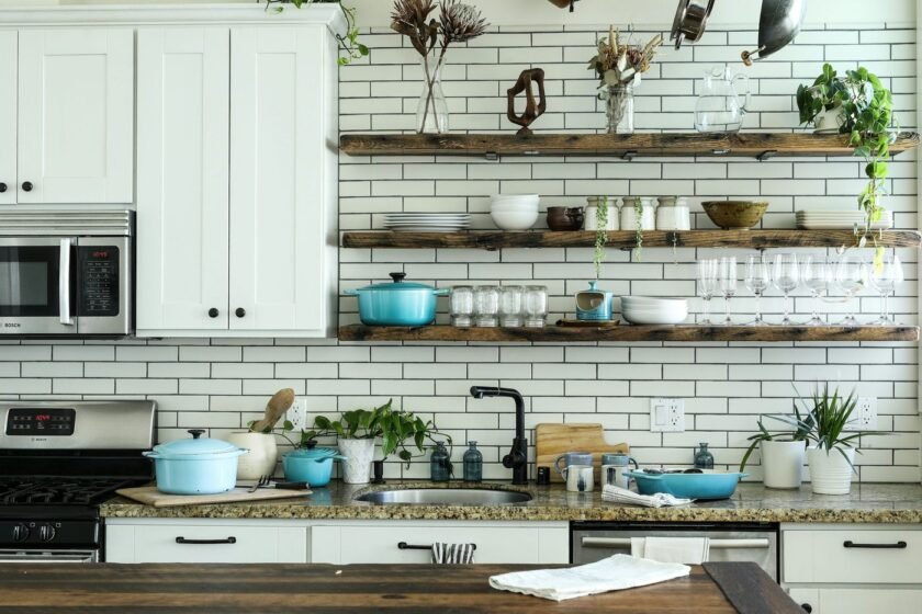
A kitchen mood board is useful when it turns scattered inspiration into a buildable plan. Instead of saving random images, use a mood board to decide the room’s palette, materials, lighting mood, and level of contrast before you shop or renovate.
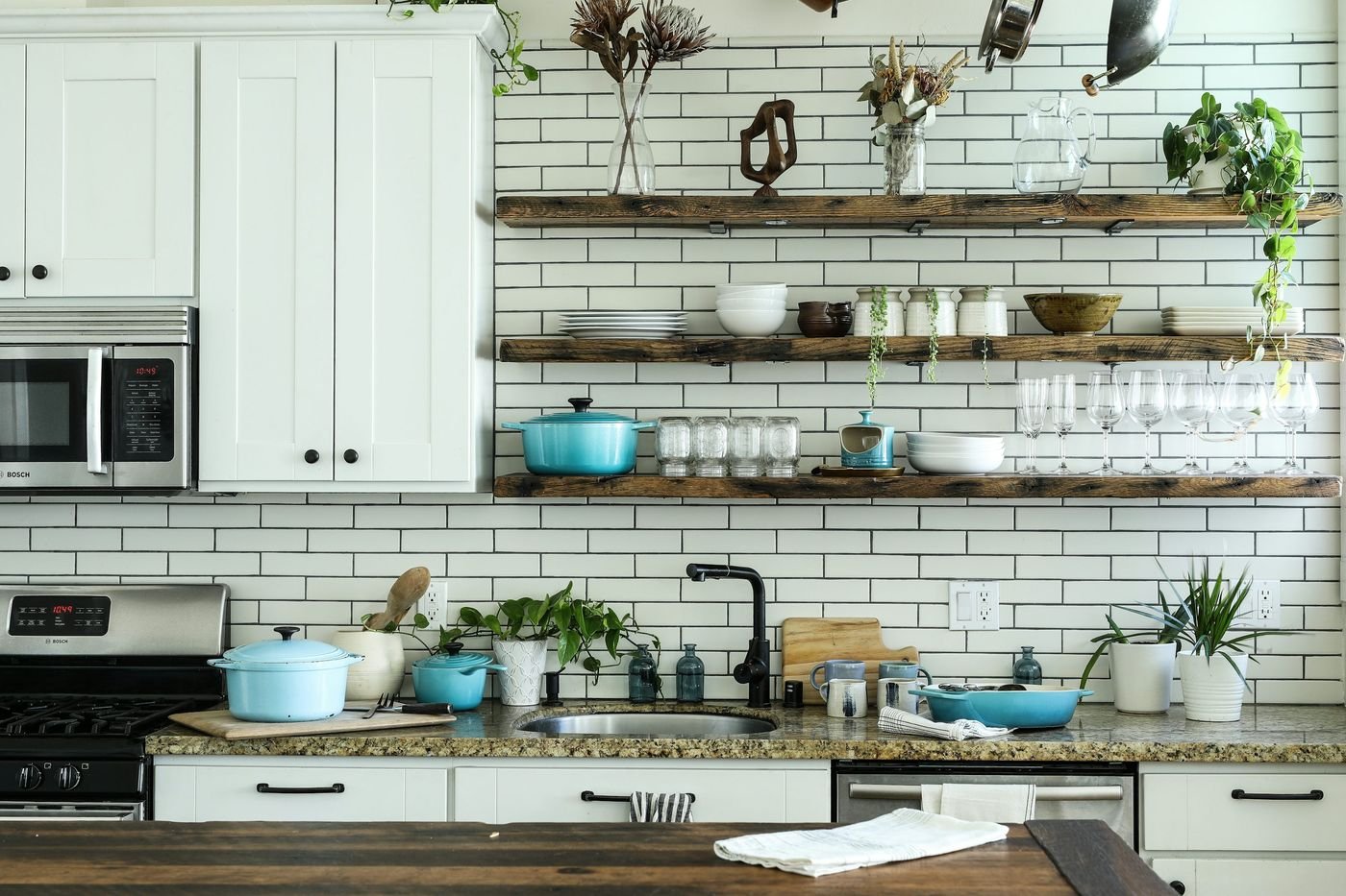
What a useful kitchen mood board should answer
By the end, you should know how the kitchen should feel, which materials repeat, where the visual contrast sits, and what is fixed versus flexible. A mood board is not a final shopping list; it is a filter for making consistent decisions.
Choose a direction
Warm modern
Combine cream cabinetry, medium wood, simple stone, and black or aged-brass accents. Keep shapes clean and let the warmth come from texture.
Soft Scandinavian
Use pale wood, white or light gray, practical storage, and a small amount of muted color. The key is calm function rather than an empty room.
Moody contemporary
Build around a deep green, navy, charcoal, or brown element, then balance it with warm lighting and reflective surfaces. Test dark colors in the room’s actual light.
Collected vintage
Mix painted furniture, patterned fabric, aged metal, and handmade-looking ceramics. Repeat one color so the collection feels edited.
Natural farmhouse
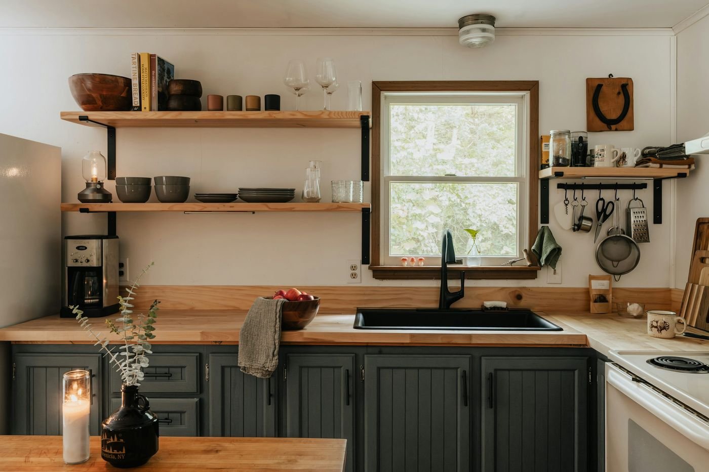
Use warm white, wood, linen, woven texture, and simple hardware. Limit rustic signs and novelty accessories to keep the room current.
15 mood-board frameworks
1. Cream, oak, and aged brass
A flexible base for a bright kitchen. Add contrast with charcoal grout or a dark pendant.
2. Sage, walnut, and warm white
Works well when you want color without a loud primary shade. Repeat sage in art or textiles.
3. Navy, marble-look surface, and brass
The dark cabinetry becomes the anchor. Keep the remaining finishes quiet and use warm bulbs.
4. Terracotta, cream, and natural fiber
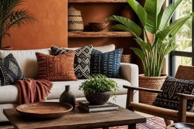
Use terracotta in tile, paint, or accessories, then soften it with woven stools and pale walls.
5. Black, light wood, and white
Graphic but approachable. Keep black to a few large elements and use wood to prevent the scheme feeling stark.
6. Dusty blue, nickel, and stone
A cooler scheme that suits bright rooms. Add a warm wood board or stool for balance.
7. Olive, clay, and cream
Earthy colors make a practical kitchen feel grounded. Repeat clay in small amounts rather than painting every surface.
8. White tile, wood, and woven texture
A simple rental-friendly direction. Use lighting and hardware to give it personality.
9. Charcoal, walnut, and amber light
Best for a dramatic evening mood. Plan enough task lighting so the room remains functional.
10. Pale pink, mushroom, and brushed metal
Soft and grown-up when the pink is muted and supported by neutral stone or wood.
11. Two-tone green cabinetry
Use a lighter upper or wall color with a deeper island or lower cabinet. Keep hardware consistent.
12. Checkerboard floor and quiet walls
Let the floor provide pattern while cabinetry and backsplash remain restrained.
13. Handmade tile and simple oak
Irregular tile adds craft character. Balance it with straightforward furniture and open space.
14. Stainless steel and warm wood
Commercial-looking metal becomes more welcoming beside oak, linen, and warm lighting.
15. Neutral layers with one strong artwork
Use varied creams, taupes, and wood tones, then let one print or painting provide the color.
How to turn a mood board into a real plan
- Save no more than three reference images for each category: palette, cabinetry, counters, lighting, and styling.
- Extract the repeated colors and materials instead of copying a single room.
- Label each choice permanent, replaceable, or purely decorative.
- Order samples and place them together in the actual room.
- Write a short rule such as “warm, simple, practical, with one deep green accent.”
Common mood-board mistakes
Avoid combining several unrelated styles, choosing finishes from different lighting conditions, or treating an image’s architecture as a product. A dramatic kitchen may look good because of its windows, ceiling height, or flooring—not only its paint color. Translate the feeling into choices your own room can support.
FAQ
How many colors should a kitchen mood board include?
Start with a base, a supporting neutral, and one or two accents. Materials such as wood and stone count as visual colors even when they are not paint.
Should the cabinets or countertops be chosen first?
If the cabinets or counters are staying, they are the fixed point. If both are new, choose the larger or more expensive surface first, then coordinate the other elements.
Can a mood board work for a small kitchen?
Yes. A smaller room benefits from a clear palette and fewer competing finishes. Use the board to protect visual calm and preserve useful storage.

Leave a Reply